Hello there friends,
I'm back today with a new layout for Fancy Pants Designs.
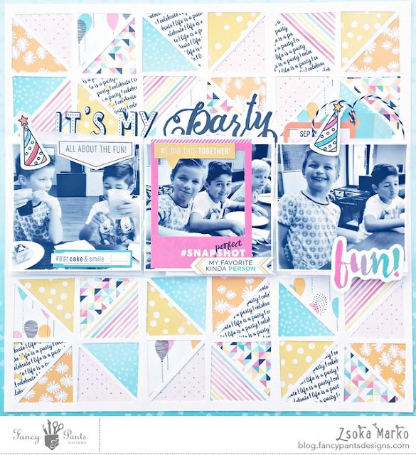
I've used Kim Watson's Joy Parade collection for this. I find this collection to be great for scrapping party/celebration photos, so again, just like last time, I chose some photos from my son's birthday party.
I chose a background cut file and cut this a bit smaller than 12x12 because I wanted to add a border around it. I backed the file with 8 different patterned papers. Since the openings are quite small I used papers from the 6x6 paper pad, because the patterns are smaller and more visible. This process took a while, so I was watching some of my favourite TV shows while working on this :). Once done, I glued the cutfile on a 12x12 sheet of paper from the same collection. It's got this ombre look to it and I loved the way that looked as a frame.
I chose 3 photos of my son and his best friend, aren't they adorable? I love these two! I printed these photos in the same size as the big squares of the cut file and placed them in the middle (I knew I was going to do this, so I did NOT back the middle row!). I went with black and white photos because my background is very busy and I still wanted the photos to stand out. I layered some white tissue paper behind the photos to give them a lift and a bit of a bigger white border.
I was dying to use the puffy alphas from this collection! I love them so much! Eventually I ended up using a die cut as part of my title too, to add more interest.
Finally I added some embellishments around my photos: tags, labels and die cuts. There were these two party hats I loved, I glued them on top of my son's head - just for fun really!
I added my date on a tag above my photo. I did not add any journaling because this layout is part of a series I'm going to have in my album and I already wrote journaling on some others.
I encourage you to try using a mix of patterned papers for your background, it's fun! You can always tame it with black and white photos and accents/borders to achieve a well balanced look.
Thank you for stopping by today! See you soon X


