Showing posts with label Horizon. Show all posts

Thursday, February 18, 2021

Big Day - DT Layout for Paige Evans

Hi there crafters,

I'm back today with a new layout to share, that I created for the Paige Evans Design Team. 

A few weeks ago, my boyfriend was feeling generous and got me some presents! One of them was the We R Memory Keepers Button Press, which I've been wanting since I first saw a demo with it. Obviously, I had to try it right away! So, as soon as it arrived, Maxim and I unpacked it, and tested it out. So much fun! I decided to make a layout primarily with buttons. I saw Angi use a photo to create a button with her Button Press, which inspired me. I based my idea on a layout I made some years ago, where I cut up a whole 12x12 patterned paper that was a big image, into circles and kind of pieced it all back together like a puzzle. Except here I did it on a smaller scale, I used a smaller photo (slightly smaller than 4x6") with the same technique. It would have been cool to use a 12x12 photo and cover the whole layout with buttons but I didn't have so many large buttons, plus it would be a pretty expensive layout, if you know what I mean. Maybe one day!


I chose a recent photo of Maxim, that I took when he came out of the orthodontist's practice, showing off his braces! I was not allowed to go in with him, due to Covid-19 regulations, so this was the first time I saw it! I went with a blue-yellow color scheme, since he is wearing these colors in the photo. This color combo is not my favorite when it comes to arts - I like it on kids, yellow jacket with blue jeans etc. But not in crafting or arts. Weird huh? Anyway, I thought it would be easy since Paige's collections always have these colors. I ended up using a mixture of the Go the Scenic Route, Horizon, Truly Grateful and Pick Me Up collections.


I first selected my patterned papers, then created my buttons. At the end of this post you'll find a process video - if you're interested in how I made the buttons! It's pretty simple, once you figure it out! Oh, I also used that smiley button with the braces, that Maxim got at the orthodontist's - I thought it would be fun to add this keepsake to the layout! Otherwise it would have ended up in the trash at some point, I'm sure.


I also created a button with the journaling - for this I wrote my text onto a ledger patterned paper, then I turned it into a button. I arranged everything on my layout and added a few embellishments: chipboard hearts and circles, enamel and puffy sticker shapes, a few card stock stickers. I also used a die cut tag at the top and created two more from patterned papers. I made a label for my date, as well. For my title, I mixed and matched some alphas from various collections, and I love how that looks! It's great that I managed to find the right shade of yellow embellies for this project, it's not always an easy task!


To finish off my layout, I added two strips of patterned paper at the bottom, in coordinating colors. That's it! Super simple and quick, but I hope I could inspire you in some small way! As promised, here's the process video too:


Thank you very much for stopping by today!
Have a wonderful day!

X


Horizon collection: Paper 5


Saturday, August 8, 2020

Rainbow Card Duo - DT project for Paige Evans

Hello there crafters,

I'm back today with a pair of cards I've made for the Paige Evans Design Team!

While I was working on other projects with the Horizon collection, I found this rainbow panel I had die cut from a 6x8" paper ages ago, so I decided to turn it into a card finally. This is how I ended up with a rainbow theme, but also, rainbows are very easy to create with Horizon, since there's papers in every possible color in this collection!


For my first card I die cut the The Struggle Is Real cut file (Design ID: 324925) from white card stock. I sized it to fit a 5.5x4.25" card panel. 


I chose 17 patterned papers in all the colors of the rainbow and die cut the inner pieces with my Cameo too. I also used the white fall-out pieces to make the letters stronger - so I glued the patterned paper letters on top of the white ones. I then added foam adhesive to each to create a dimensional design.


I created my top folding A2 size card base (landscape format), then I adhered a slightly smaller, embossed gray panel on top. I glued down the outlines with liquid glue and adhered the colorful letters too. First I splattered some white acrylic paint but it was barely visible on the light gray card stock, so I decided to add gold splatters too. To finish off this card, I added a chipboard flower and some enamel dots.


For my second card I created another top folding, A2 size card base, then adhered the rainbow panel to it. 


I die cut the Flower Wreath cut file (Design ID: 273818) in a small size and glued it down on my card front. I also added back the white inner pieces of the flowers. I will say, my blade and mat are both old so my Cameo didn't do a fabulous job on the wreath, but I thought it was still acceptable...I didn't dare ordering new mats and blades just before holiday, in case they don't arrive in time. So as a tip, if you want to die cut something more elaborate and delicate in small sizes like this, make sure your blade is relatively new. The mat shouldn't be brand new though, because it will be too sticky and it will be impossible to pull off tiny cut files without tearing them.


For my sentiment I used chipboard alphas, in colors that match the paper beneath. I also added a chipboard flower and some enamel dots.


That's pretty much it, easy peasy! What do you think?

Thank you for stopping by today! Stay safe!

X


Thursday, July 23, 2020

Summer - DT layout for Paige Evans

Hi there friends,

I'm stopping by today to share a new layout I've created for the Paige Evans Design Team.

I've used the Horizon collection because it's travel themed so I find it very easy to work with it! I can't wait for Paige's new collection, Go the Scenic Route because it's also travel themed yay! It's my favorite type of scrapbook collection!


I die cut the Summer cut file (Design ID: 323227) from white card stock, then backed it with a variety of patterned papers in orange, pink and blue. I adhered it down on my chosen background paper.


I added some tissue paper behind my photo as well as some little bits and pieces of paper for color: a die cut stamp and a tag with my date. I popped some colorful sentiments on my photo and I also placed a paper clip airplane on it.


I then checked my embellishments, what else would fit my theme/colors and I found a few flowers and other die cuts, plus some puffy stickers. I scattered these around my page.


Last but not least, I added a few enamel dots! I didn't bother with journaling because it was just a random photo of me standing in front of our holiday home - now that I think about it, I could have at least written that or? I mean, sure I remember now where this was, but who knows if I'll still remember later?


That's it for today! I hope I could inspire you in some small way!

Thanks for stopping by! Have a wonderful day!

X

Thursday, June 18, 2020

But first coffee - DT layout for Paige Evans

Hello crafty peeps,

I'm stopping by to share a new layout for the Paige Evans Design Team! 

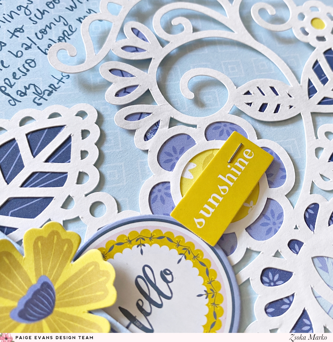
While I had the Horizon collection out last time, I decided to create another layout with it! I had had this photo on my desk since last summer but never really found a collection that worked with the colors. Enter all the blues and yellows in Horizon and we have a perfect match ha!


I can't drink coffee anymore but last summer I could still enjoy a couple of espressos a day! I loved sitting on the balcony with a cup of foamy goodness after Maxim left for school in the morning! Over the years I got used to craft at night so I often sleep very little and espresso helped me wake up and make myself useful :D.

I picked out my cut file first, totally random, nothing to do with the layout, but I really don't mind using flowers on everything...This one is one of the newer ones, Flowers (Design ID: 321569) and it's so pretty!


I then selected all the blue and yellow papers and went through the embellishments too. Luckily there were plenty of things to choose from! I backed the cut file then glued it down on my background paper. 

I added my photo then started embellishing my page. I tucked some tags and labels behind my photo. I created the date label from patterned paper and white card stock. I like when my labels match the rest of the papers! I added sentiment stickers, die cut flowers and chipboard stickers. 


For my title (very original, isn't it?! But so true, so too bad :D) I used the navy mini alpha thickers from the Pick Me Up collection. To finish off my page I added my journaling and a few enamel dots.


That's all! Do you guys prefer limited color palettes like I used here or are more into colorful layouts? I love them all the same! I also love monochromatic!

Thank you for stopping by today! Have a wonderful day!

X

SUPPLIES:
Pick Me up collection: Mini foam alpha thickers

Friday, May 29, 2020

Chocolate Nation - DT layout for Paige Evans

Hello there crafty friends,

I'm back today with a new layout for the Paige Evans Design Team! It feels like I rarely scrapbook anymore so I'm always excited and happy when I actually have something to share ha!


I started out with the Bloom Street collection but ended up mixing it with lots of Horizon papers! I haven't used Horizon in ages so this makes me super happy! 

This gorgeous floral paper from Bloom Street is one of my favorites from the collection and I haven't used it yet, so I was determined to do so on this layout! I picked out this super cool cut file, Heart Swirls (Design ID: 321567) which kind of reminded me of rainbows, so I backed it in that manner! 


It turned out to be a bit too busy for the floral paper so I only used a wider strip at the top and a thin strip at the bottom. I thought it paired well with the pink/yellow watercolor paper from Bloom Street. I added foam to the cut file and adhered it to the background. 

I layered some tissue paper behind my photo as well as a tag, then glued it down. I documented a photo from our summer holiday last year, we took the kids (my best friend's twins and Maxim) to Chocolate Nation in Antwerp. This is the coolest and most fun museum we've been to! Well to be fair we don't go to museums all that often, but all of us loved this one so much! It's interactive, the way you're guided through each room is awesome. Super entertaining, the kids were glued to their headphones. And of course, there were several stops where you can try all kinds of chocolates. My goodness, heaven! Belgian chocolate is my favorite, so yeah, I didn't mind going hehe! They also showed us how to make pralines and we could try them too. There were photo booths with props, for instance there was this one where you could "fake" lift a huge jute bag filled with cocoa beans (it was hanging from an invisible thread and you just moved it to the height you wanted) in a tropical kind of setting - the kids loved posing for photos! At the very end there was a room filled with all kinds of melted chocolate from white to dark and everything in between! And you could eat as much as you wanted! I will say though, even taking a tea spoon full from each (and I haven't tried the super dark ones) you felt full. And there was ruby chocolate OMG! Have you ever tried it?! It's super hard to find it still but it's so worth it. It's pink, fruity, reminds me of raspberry. It's all natural though, so no artificial fruit flavor. God it's so good! Then of course there's a shop as you exit the museum and you can buy so many things, we spent ages there. The kids picked up some S'mores kit to try and they were so happy they were allowed to barbecue alone. If you're ever in Antwerp, definitely check it out!

Phew that was a long story, sorry for getting off track! Back to the layout now :)


I used the white mini alpha stickers from the Pick Me Up collection to create my title following the curve of the cut file. I wrote my journaling on the opposite side.

For embellishments I mostly used floral die cuts which I layered next to the photo, alternating between liquid and foam adhesive to create some dimension. I then cut out some colorful sentiments from one of the patterned papers and adhered these down too. Last but not least, some white glitter enamel dots, they are sooo pretty!


That's it! I hope I could inspire you in one way or another with my layout today!

Thank you for stopping by! Happy scrapping!

X

SUPPLIES:
Bloom Street collection: Paper 13, Paper 22, Paper 23, Enamel Dots, Floral Die Cuts
Truly Grateful collection: Paper 16
Pick Me up collection: Mini foam alpha thickers


Friday, October 18, 2019

Cards for boys - DT project for Paige Evans

Hello there crafty people,

I'm stopping by today to share a bunch of cards I've created for the Paige Evans Design Team. None of which features flowers...wait whaaaaat?! I'm all for flowers. I mean, I'd always go with flowers on any card, especially when I don't use stamps. When I was a little girl, I got a book from a botanist friend of my parents, called "Zsófi kertje" (Zsófi's garden), because I loved flowers so much (plus she thought the little girl on the cover looked liked me haha). She figured maybe I'd become a botanist myself - a thought that never actually crossed my mind for some reason. In fact, I am so bad with plants it's comical. So I'll just stick to paper flowers that can't die on me :D. BUT lately I've realized I never have cards that my son can give to his friends, so I decided to make a few to have on hand when he needs them.


I've mostly used the Truly Grateful collection plus a few things from Horizon too. I went with a blue-green color scheme because there's plenty of papers and embellies in these colors in both collections. All of my cards are mounted on A2 size top folding card bases, which is my preferred format for my cards. 


I then selected and cut a few of Paige's cut files: Anchor (Design ID: 300203), Llama Alpaca (Design ID: 293591), Today is a Good Day (Design ID: 290292), Star (Design ID: 289468) and Fish Background (Design ID: 299191). I more or less designed the cards in Silhouette Studio already, so that I knew what size the cut files should be. I then backed them all with patterned papers.


The sentiments were a bit tricky and I swear I spent the most time on selecting those! I would have preferred to write Happy Birthday on all of them but I didn't want to use a stamped sentiment so I just went through all embellishments from both collections, multiple times, before I finally settled on these five. I like my sentiments to be meaningful - as in, I want to use something that makes sense when I give the card to someone. I didn't just want to add some random die cut. So you see why this part took me ages haha! But I think most of these will work for birthdays or at least as "just because" friends cards or so.


I was going to back this big Today is a Good Day sentiment but quickly changed my mind when I saw the size once it was cut ha! The thought of cutting al those miniature letters was just too overwhelming! Instead, I cut a bunch of strips of various patterned papers - which I've been loving to do for awhile - and created a colorful background. I then just glued the cut file on top. I added some of the inner pieces too, for interest.


I had to make a llama card because Maxim loooooves llamas. I'm not sure he will be too excited about the bling I put on it but he does have a friend who appreciates everything shiny, glitter etc :D. I used some dies to create my background as well as an embossing folder to add texture to the white paper at the top. This sentiment comes from one of the 2x2 paper pads!


Personally, I love this last card the most. I fell in love with this cut file when Missy used it on her amazing layout a while back and I've been wanting to use it ever since. Fish work for boys cards just fine :). 


That's it! I didn't go into details because I think it's easy to see how these cards were put together. But if you have any questions, just ask below or send me a message, I'm happy to help!

I hope I could inspire you in some small way!
Thanks for stopping by today and have a great day!

X

SUPPLY LIST:
Horizon collection: Paper 5, Paper 8, Epoxy Stickers

Friday, August 9, 2019

Happy - DT layout for Paige Evans

Hello crafty friends,

I'm stopping by today with a new layout I've made for the Paige Evans Design Team. Still on my quest of finding new color combos in the awesome Horizon collection, I've come up with this yellow-blue-green combo! It's perfect for boys!


I really wanted to use the frames from one of the patterned papers because they are absolutely gorgeous, I love the colors, the watercolor effect, the super fun definitions! Plus the colors I chose had the perfect theme for my photo! So I definitely wanted those to be visible! Keeping that in mind I started playing with arrangements - I'm not a fan of lineal things so a plain old grid just didn't cut it. I prefer a scattered, random but still organized look - if that makes ANY sense at all lol!


Once I kind of knew what I wanted, I started working on my background. Lately I've been making lots of cards using paper strips and I absolutely love them. I used to draw inspiration from my layouts to create cards, now it was the other way around! I love the color of the dark green paper but I found it too dark for a full background, so I just used it for the middle section of my page and I cut strips from other papers for both sides.


Then I glued down the frames and my photo in the middle and started embellishing. I pulled everything travel related I could find (chipboards, stickers, tags, clips, die cuts, charms) but it wasn't enough, so I just went with colors. As in, I totally used embellies that make no sense (flowers and leaves?!) thematically, but I am not bothered by it. As long as the colors match, I'm OK. I also added some buttons from my stash that are not by Pink Paislee, but I just recently got them and the colors were perfect, ha!


To finish off my page, I added a chipboard title and my journaling! That's it!
I hope you are inspired to try different color combos - big collections like Paige's are perfect for coming up with various, maybe a bit unusual combos! Don't be afraid to give it a try, what's the worst that can happen?!

Thanks for stopping by! Have a lovely day!

X

SUPPLY LIST:


Friday, July 19, 2019

Smile - DT layout for Paige Evans

Hey there crafty friends,

I'm back today with a new layout I've created for the Paige Evans Design Team! I've used the Horizon collection again, and remember my challenge for myself was to not go with a rainbow color scheme. Today I'm sharing an orange/coral/pink/purple combo! I'm so in love with these colors!


This layout is actually a lift of an older layout of mine (I just checked the date, and I can barely believe it is from 2 years ago OMG), which was similar in colors actually, except it had teal instead of purple! Check it out:


This was one of my most favorite layouts ever, so I thought I'd give it another go. And my best friend wants it so...Haha!

I die cut loads of leaves using some dies (again, you can totally go with cut files if that's easier for you, I just had a lot of small scraps and it was quicker this way!) in each color. Once done, I looked for a paper I could use for background and I found this gorgeous purple ombre paper in the Whimsical collection. 


I roughly arranged the leaves on the background so I knew how many I needed. I started gluing down the bigger ones. I'll be honest, I just eyeballed all of it, but if you don't feel confident in doing that, just use temporary adhesive first. I'm OK with imperfection! Once the big leaves were adhered, I added the smaller ones in between too.


I adhered some foam tape to the back of my photo and placed it in the middle of the flower. Then I started embellishing. I pulled out everything that matched my color scheme. Some are totally random but I don't mind. I went with a tone on tone look and used chipboards, stickers, die cuts, epoxy stickers and some sentiments from one of the Whimsical patterned papers. Actually they were probably on the manufacturer's strip at the bottom of the purple background paper because I did not go through Whimsical at all trying to find embellies. I glued everything down, for some I used liquid adhesive, for others foam tape, to add dimension. Oh here's something I was pretty happy about! There's a paper in Horizon with different colored frames, which I used on my next layout so I had it on my desk. There were frames in all the colors I used here and all of them had a phrase on them that fit my photo perfectly! I love love love happy accidents likes this! So I cut out the phrases and created a strip at the bottom of my layout.

To finish off my page I added some white ink splatters and wrote my journaling with a white gel pen. That's it!


Aaaaand because I had a bunch of leaves left and I don't throw away anything...I thought I might as well make a quick and easy card using them!


I created a top folding A2 size card base and added a white, embossed panel on top. Then I created a big flower and cut off the access on the left side.


Again, total luck, I found this beautiful journaling spot in the ephemera pack! I added foam tape to it and glued it down in the middle. For sentiment I used a sticker which I also popped up. To finish off this card I tied a twine bow at the top and added gold paint splatters. Seriously the quickest card I've ever made, I even feel guilty about it hahaha! I mean everything was already die cut, the design was there on the layout, so it really didn't take long to put it all together!


I hope I could inspire you with my layout and card today! If you give these a try, tag me on Instagram (@zsoka_marko).

Thank you so much for stopping by!

Have an awesome day!

X

SUPPLY LIST:
Whimsical collection: Paper 8