I'm back today with a new layout to share, that I created for the Paige Evans Design Team.
A few weeks ago, my boyfriend was feeling generous and got me some presents! One of them was the We R Memory Keepers Button Press, which I've been wanting since I first saw a demo with it. Obviously, I had to try it right away! So, as soon as it arrived, Maxim and I unpacked it, and tested it out. So much fun! I decided to make a layout primarily with buttons. I saw Angi use a photo to create a button with her Button Press, which inspired me. I based my idea on a layout I made some years ago, where I cut up a whole 12x12 patterned paper that was a big image, into circles and kind of pieced it all back together like a puzzle. Except here I did it on a smaller scale, I used a smaller photo (slightly smaller than 4x6") with the same technique. It would have been cool to use a 12x12 photo and cover the whole layout with buttons but I didn't have so many large buttons, plus it would be a pretty expensive layout, if you know what I mean. Maybe one day!
I chose a recent photo of Maxim, that I took when he came out of the orthodontist's practice, showing off his braces! I was not allowed to go in with him, due to Covid-19 regulations, so this was the first time I saw it! I went with a blue-yellow color scheme, since he is wearing these colors in the photo. This color combo is not my favorite when it comes to arts - I like it on kids, yellow jacket with blue jeans etc. But not in crafting or arts. Weird huh? Anyway, I thought it would be easy since Paige's collections always have these colors. I ended up using a mixture of the Go the Scenic Route, Horizon, Truly Grateful and Pick Me Up collections.
I first selected my patterned papers, then created my buttons. At the end of this post you'll find a process video - if you're interested in how I made the buttons! It's pretty simple, once you figure it out! Oh, I also used that smiley button with the braces, that Maxim got at the orthodontist's - I thought it would be fun to add this keepsake to the layout! Otherwise it would have ended up in the trash at some point, I'm sure.
I also created a button with the journaling - for this I wrote my text onto a ledger patterned paper, then I turned it into a button. I arranged everything on my layout and added a few embellishments: chipboard hearts and circles, enamel and puffy sticker shapes, a few card stock stickers. I also used a die cut tag at the top and created two more from patterned papers. I made a label for my date, as well. For my title, I mixed and matched some alphas from various collections, and I love how that looks! It's great that I managed to find the right shade of yellow embellies for this project, it's not always an easy task!
To finish off my layout, I added two strips of patterned paper at the bottom, in coordinating colors. That's it! Super simple and quick, but I hope I could inspire you in some small way! As promised, here's the process video too:
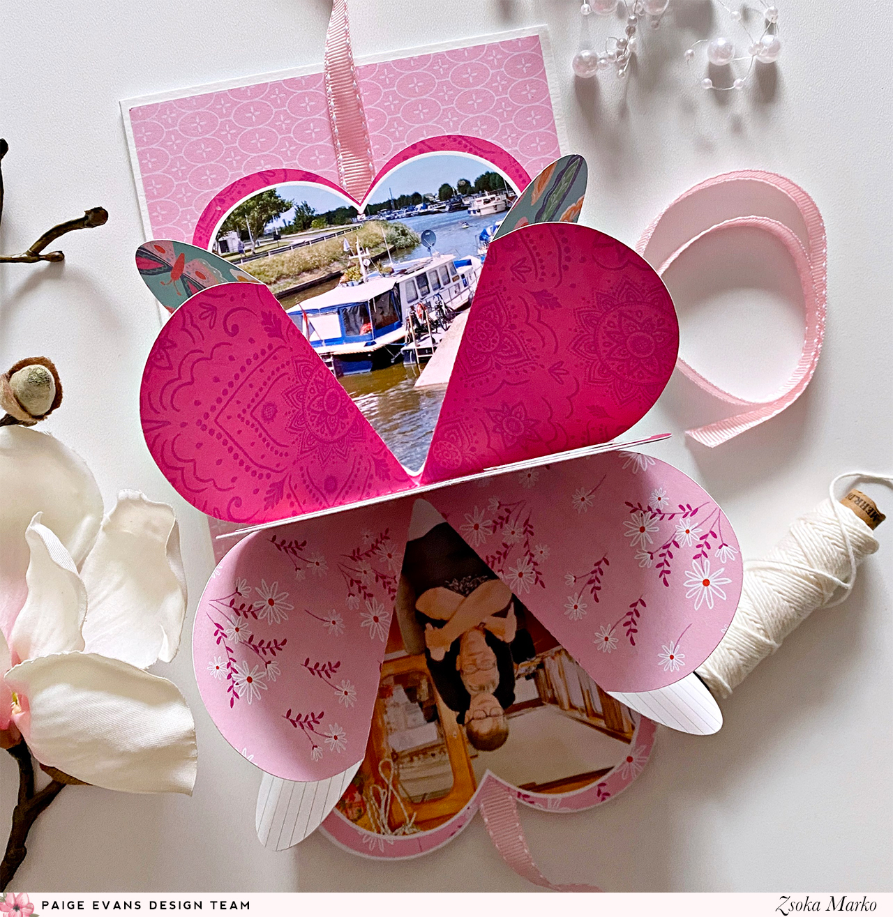
I'm stopping by today to share my newest projects I've created for the Paige Evans Design Team! Since Valentine's Day is creeping up on us, I thought I'd make some cards for the occasion. Not that we actually celebrate this day, but with the pandemic going on, I do mail cards to my parents more often than I normally would and my mom anyway has what we call name-day in Hungary on February 12, so 2 birds one stone, you know :). Since I made one for my parents, obviously I also made one for Martin's mom (and need to make one for his dad as well, but at the time I'm writing this post, that card is not ready yet).
I called these "cards with a twist" because the hearts reveal some photos when you open them. Both cut files I used are for mini albums, but I thought they would be perfect for my purposes.
In retrospect, I should have used the Folding Hearts on both, because that one ended up being less thick (better for mailing) and fits bigger photos too. I like both though, and for mini albums, where you don't need to worry about thickness, they would be both just as adorable!
I used the Go the Scenic Route collection and went with a pink/orange/red color scheme. I love this combo so much, it's cheerful and fun! Once I selected my papers, I sat down to my PC and sized the cut files to the right size - for this I drew a 5x7" rectangle, which is my card size, and placed the hearts on it, to see what size I want. Then I scaled down the cut file (all pieces grouped together). I then die cut everything I needed for both cards and printed my photos in the right size and shape too (for my first card I used heart shaped photos).
Putting together the heart is self-explanatory, you just need to fold the paper along the lines, and you'll see it all come together. I did film the process though, you'll find the link to the video at the end of this post, if you're more the visual type!
Once I glued all the hearts together, I added my photos as well. I only added two card stock stickers to embellish the photos, because I didn't want to add more dimension to the card. I was somewhat sad because I love layering things up!
I then started working on the card bases. They are very simple, I started with a layer of white card stock, then a slightly smaller patterned paper panel. And because I love adding patterned paper strips at the bottom of everything, I did that here too.
To close the heart, I added some ribbon - which I glued in between the folded hearts and the front cover. I also adhered a piece of heavy weight card stock to my heart cover, so it is sturdier and added some machine stitching for interest. Then I glued the mini onto my card front.
Finally, I decorated the front of the mini - for this I used a few flower die cuts from the ephemera pack. For my sentiment I selected letters in matching colors from the Puffy Word Stickers pack. I like to mix and match letters from this pack instead of using the words that are in there. I stitched these down on a piece of white card stock, which I then tucked under one of the flowers.
The mini album is a bit different on the second card - I needed 3 sections to have enough space for 4 photos, on the other one 2 was enough.
I die cut the base of the album from white card stock and used patterned paper for other pieces that you need to glue on the base to make your mini fun and colorful. This album is pretty straightforward too, as you fold and glue the pieces together, you'll notice which way to fold each section so it all collapses the right way.
Again, I only added 2 card stock stickers to avoid adding more bulk to the card. It's quite boring this way, but I figured, these are cards in the first place, so the hidden photos are already a bonus haha!
Originally, I was planning to punch holes and use eyelets on the right side of the heart, to close it with a ribbon, but I realized that the heart would then open up on the left side. So, I ended up adding the ribbon the same way as on the first card, but this has a downside too - the album doesn't open up the way it was intended. You can still open it and see the photos, but the album won't unfold completely. I guess that's OK though, in this case. If it was a mini album, I would probably just wrap something around it, that is removable.
Because I love the paper I used for the cover so much and even made sure I die cut the heart from the part of the paper that had all these colorful little hearts on it, I obviously was not going to cover it all up with embellishments. That paper is just too special! So, I decided to only add a sentiment. To finish off this card, I placed a few glitter enamel hearts on the paper strip at the bottom. They are the perfect colors too!
That's it! I hope you like this idea and will give it a try sometime.
Oh I almost forgot to link in the Process video! Here it is:
I managed to finish the third card, that I mentioned earlier, too, but I don't want to re-write the whole blog post, so I'll just add some photos here. This is the same as the first card, only with different patterned papers. I love blue, so this one may actually be my favorite!
Thanks for stopping by today! Have a wonderful day!
I'm stopping by to share with you my latest project I've created for the Paige Evans Design Team. I've used the awesome Go the Scenic Route collection on this layout. Apropos collection - are you as excited as me about getting Paige's latest collection, Wonders?! It's so gorgeous and perfect for spring! I need sunshine and colors! Today's page is proof of just how much I miss sunshine hehe!
I left a bit of white edge around the layout in this photo, so you can see the edges - the white is my desk, not a part of the layout :). The cropped version just didn't look right!
Anyway, I chose an orange and pink color scheme, to go with my pink lemonade in the photo. I've been wanting to use this map paper for a long time because it has such a lovely color (and I am not even a huge fan of orange!), but I just didn't get around to do it yet. In fact, I thought it looked too much on this layout too, but then I just went with it anyway.
I chose the Summer cut file (Design ID: 272002) and die cut it in 3 sizes from white card stock. I left the smallest one as is, I just cropped the top off in Silhouette Studio. I did, however, remove all lines from inside the circle on the other two sizes, because I knew they would only serve as layers. To make my life easier, and not having to back the rays one by one, I just die cut the sun from three patterned papers. For this, I released the compound path on the cut file, then welded all lines together to create a fill shape rather than having outlines. Then I also did an internal offset a bit smaller than the original design (all three sizes), just so that they are easier to line up and there's no overhang in case I'm not precise. I hope that makes sense!
I adhered the patterned papers to the white outlines, but I didn't add glue to the rays as I wanted them to be more dimensional. I added machine stitching to the smallest sun and I also die cut the letters from a pink/orange patterned paper to place on top. I wrote my journaling inside the sun with a white gel pen.
To emphasise the sunny theme, I cut my background paper in strips that look like sun rays. Using my Tim Holtz serrated edge scissors, I distressed all edges. I then added a tiny amount of glue along the middle of each ray and placed them on a heavy weight card stock. Just so that they stayed in place while I stitched them down in the middle. Once done, I adhered the sun to the background too.
I layered some tissue paper, die cuts, labels etc behind my photos, then glued these stacks down too. I added a clip, a chipboard sticker and some stickers to embellish my photos. I wanted to keep embellishing to a minimum since the page already had a lot going on, lots of dimension and texture. I stamped my date on one of the labels and done!
That's it guys! What do you think? Too much? These bright colors make me so happy!
If you want to see how this layout came together, you can watch my process video here:
I hope I could inspire you in some small way! Thank you so much for stopping by!
I'm stopping by today to share a new layout I've created for the Paige Evans Design Team! I've used the awesome Go the Scenic Route collection on this project.
I really wanted to use this gorgeous green paper for my background, but I didn't want the map to be visible. This time I was going to use non-travel themed photos, so I thought the map didn't make much sense. It broke my heart a little because it is absolutely beautiful. I do have another sheet of this paper though, so I will definitely use it in the future!
I started thinking about ideas, how I could cover up this large part of the background in a fun way. There's a patterned paper in the collection that has all kinds of strips on it, and this inspired me to cut paper strips. I cut this paper apart, also cut a few more from other papers, most of which I didn't end up using. It was hard to know in advance, how many I will need exactly!
I then started gluing them down. I only added liquid glue at the top part of each strip, so I could later bend up and distress the bottom part to add dimension and a fun texture. I kind of organized the strips by color, from lightest to darkest, from top to bottom. I added some tissue paper as well as some ephemera/journaling pieces behind my photo, then adhered them to my background. I originally wanted to use the alpha thickers to create my title at the bottom, but I just didn't have the right letters in the right colors. I ended up going for the tiny puffy phrase stickers - I just used letters from different words to create a fun and colorful title. Which by the way is sarcastic (the title I mean), because my kid was clearly not too happy about having to start school haha!
I selected a few embellishments: chipboards, die cuts, stickers, that matched the colors in the background, and I added them using mostly foam adhesive. I stamped my date onto a label and tucked it behind one of the photos.
Last but not least, I added my journaling, using a white gel pen. I absolutely love using white gel pens on darker backgrounds!
You can also watch the process video if you want to see this layout come together:
That's it for today! I hope I could inspire you in some small way! Thank you so much for stopping by! Have a wonderful day!
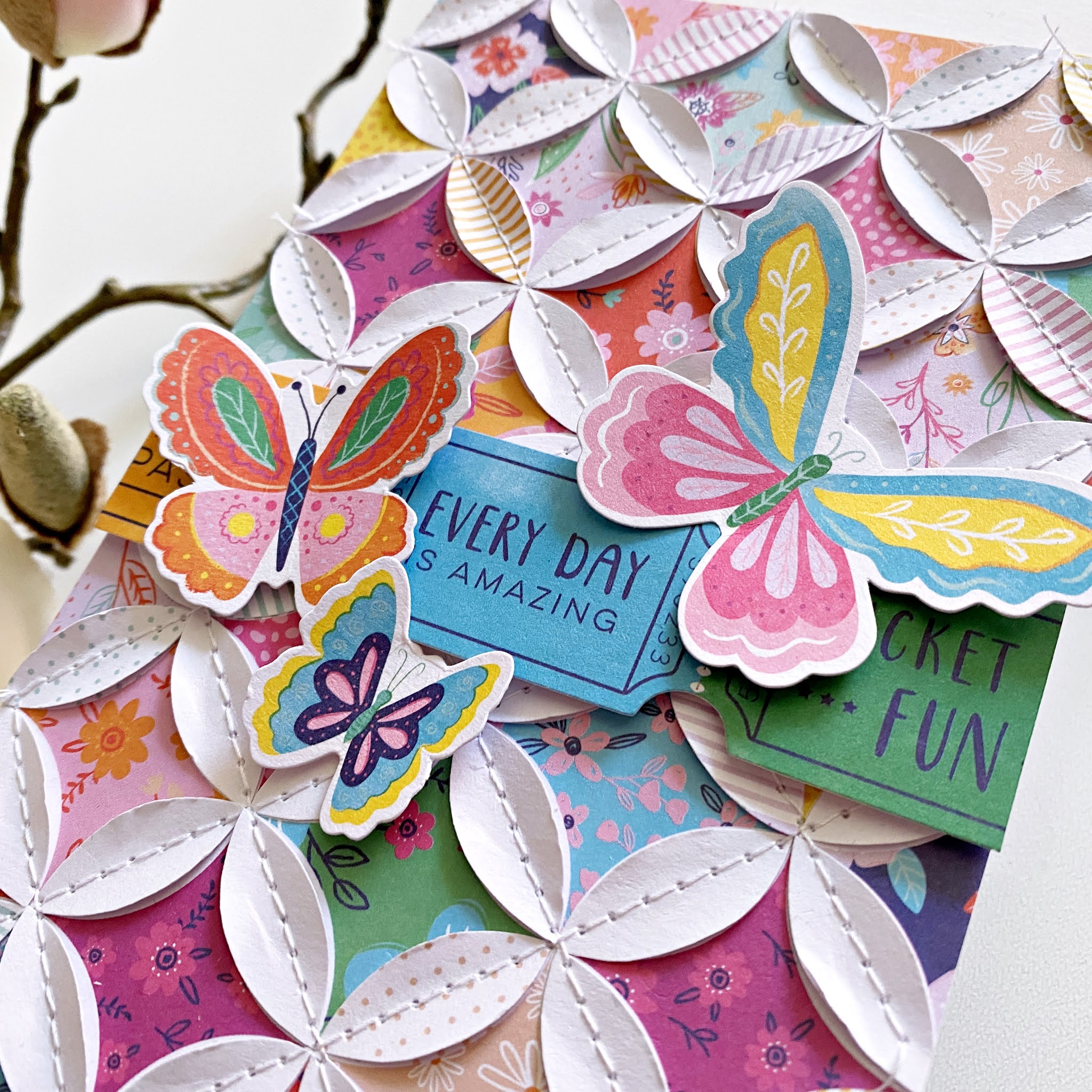
I'm stopping by today to share my latest projects I've created for the Paige Evans Design Team. This time I have cards for you with the Go the Scenic Route collection.
This year it's been even more important than before to tell our friends and family that they are loved, life is beautiful, and everything is going to be alright. What simpler way is there, than to create some handmade cards and mail it to them?
I decided to make some slimline cards that are all the rage now. Now, generally my slimline cards are about 3.5x8.5" but these three cards ended up being slightly wider, 4", because of the quilt patterned papers. I wanted to leave the circles complete, and luckily I got a full pattern with the 4" width. Does that make sense?!
For my first card, I chose a quilt patterned paper from the 6x8" paper pad. I cut it down to 4" wide, I'm not sure about the length, I just made sure that I have full circles - probably it's about 6.5"? There's two of this paper in the pad, and I fussy cut out the white shapes from the second paper. I then adhered these down, on top of the other paper, using only a tiny amount of glue in the middle of each shape, because I wanted to stitch them down and bend them up later. This creates such a wonderful texture and dimension!
I glued the patterned paper piece onto a white card stock, and then adhered these both to my card base. To finish off the card, I added a sentiment, for which I used some tickets from the ephemera pack, and I also placed some butterflies around it.
For my second card, I fussy cut a bunch of simple leaf shapes from a variety of patterned papers. I went with a blue-red-pink-orange color combo. To do this, I just drew a simple leaf shape onto a piece of heavy weight card stock and fussy cut it out. This served as a template for all the other leaves. Easy and quick, and one doesn't need any fancy tools!
I cut two layers for each leaf - sometimes when I do this design, I go with more layers, but 2 is perfectly enough. So I glued the two layers together, but only in the middle, because I wanted to stitch these down and bend up the sides as well.
Once I was done with all the stitching, I adhered the leaves to my card base. I added some gold splatter for interest. I trimmed down a die cut from the ephemera pack for sentiment and using foam tape, I added this to my card too.
The third card is very similar to the first one, the paper has the same pattern, only a different scale. But I did the same thing with it: that is, added a second layer of shapes, stitched them down in the middle, and bent up the sides.
I added three strands of twine above the patterned panel, as well as a bow. For my sentiment I used the lovely colorful alphas from this collection!
That wraps up today's post, I hope I could inspire you in some way!
I also have a process video, that you can watch here:
Thank you so much for stopping by! Have a wonderful day!
I'm stopping by today to share my newest layout I've created for the Paige Evans Design Team. I've worked with the awesome Go the Scenic Route collection!
There were two things I wanted to use on this layout, the patterned paper with all the super cool travel related icons and the foam alpha stickers. My idea was to have a longer title so I could use lots and lots of colorful alphas, but it didn't quite turn out the way I imagined it.
I started out by fussy cutting lots of icons - obviously you could do this with a PixScan mat, but I have no idea where mine is, so I thought instead of spending time on finding it, I'd just watch a movie and fussy cut them :). This was actually the most time-consuming part of the whole layout; the rest is super quick and simple. Well, except the adhering of these pieces, of course, that takes some time too.
What I wanted to do originally, is having the icons just like they are now, with a white circle in the middle, in which I was going to add my title. But I couldn't figure out a good place for my photos, so I scratched that. Also, my title didn't fit inside the circle. Oh dear. On to the next idea! This time I put my photos inside the circle, and I lined up my title with the circle - but the last word just wouldn't fit. Sheesh. I'm really stubborn though and I was not going to give up on that title! So eventually, instead of using the alphas for the last word, I just typed it up and added it between the first and last words of the title - I was thinking, this way one can actually tell where the title starts? I don't know, maybe it all makes no sense at all :D Before I glued down the typed-up word though, I stitched down the alphas using my sewing machine.
Then I arranged all my fussy cut icons and adhered them down with foam tape for dimension, texture, and interest. I splattered some white acrylic paint on the background. I then added my photos, which has some tissue paper layered behind them, as always. Since my page is already super busy, I didn't add many embellishments, just a few die cuts for a bit of color, a puffy sticker, and a paper clip. Once everything was in place, I wrote my journaling - which is super short, but I didn't need to say more.
That's it! Very simple, but I love the colorful result.
I have a process video for this layout as well if you're interested!
Thank you so much for stopping by today! I hope I could inspire you in one way or another. Have a wonderful day and see you next time!
I hope you guys are doing well! Can you believe it's the last day of September already?! It's insane how months just fly by :(.
I'm stopping by today to share a new layout with you that I've made for the Paige Evans Design Team. When I saw the new Go the Scenic Route collection, the paper that caught my eye first was the rainbow square paper! I right away thought I'd need to cut some shapes from it once I get my hands on it. So here we are! I went with one of my favorite shapes (after circles), hexagons. I have an old Fiskars hexa punch, it really doesn't cut great but for my purposes today, it was totally fine. If I had wanted to have nice clean edges, I would have used dies.
The size of this punch is perfect for this paper! I punched out all my hexagons, then spent some time on distressing the edges. I don't distress often; I prefer nice, clean edges in most cases, but I needed some dimension and texture here. I don't own a distressing tool, I used to use my nails back when I started scrapbooking haha! These days I use my Tim Holtz scissors (literally the best scissors out there) to do this, because one side is serrated so it does a great job with minimal effort.
I then played around with placement - but more often than not, I end up arranging my hexagons like this, kind of scattered around the page. I wanted to make sure they are grouped by colors too. I didn't have enough dark blue and since it's my favorite color, I just needed to add more - hence the blue spot paper (which by the way comes with a navy foiled look in the 6x8 pad, unfortunately I didn't have it back when I made this layout - that navy foil is absolutely gorgeous!)
Once I was satisfied with the look, I started to glue things down onto my background paper. I chose a white ledger paper so the colors pop more. I had to turn it upside down because there was a blue text in the top left corner which I wanted to cover up - originally, I didn't have hexagons in that corner. In hindsight, I really didn't need to do this but hey, it's easy to be wise after the event ha!
I alternated between liquid and foam adhesive, to create a bit of variation and dimension. I layered some tissue paper behind my photo, then glued it down. I tucked in some labels here and there and added a chipboard geo tag on top of my picture.
I kept my embellishing at a minimum - I mainly used chipboards and a few die cut pieces from the ephemera pack. I love adding lots of embellishments, but lately I'm having trouble doing so on my boys layouts - it's a whole new experience scrapping a tween! I used to make such sweet, colorful and fun layouts for my little boy but now that he is so big, I struggle, there's no doubt about it! Awww time, will you please stop?!
Finally, I added my date and wrote up my journaling. Done!
I hope you like this colorful layout, and I could inspire you in some small way!
Thanks so much for stopping by today! I'll be back with another post soon (possibly with an extra surprise, but that depends on a bunch of things still hehe! Watch this space!).