Showing posts with label Silhouette Design Store. Show all posts

Friday, February 5, 2021

Valentine's Day Cards with a Twist - DT Project for Paige Evans

Hi there friends,

I'm stopping by today to share my newest projects I've created for the Paige Evans Design Team! Since Valentine's Day is creeping up on us, I thought I'd make some cards for the occasion. Not that we actually celebrate this day, but with the pandemic going on, I do mail cards to my parents more often than I normally would and my mom anyway has what we call name-day in Hungary on February 12, so 2 birds one stone, you know :). Since I made one for my parents, obviously I also made one for Martin's mom (and need to make one for his dad as well, but at the time I'm writing this post, that card is not ready yet).


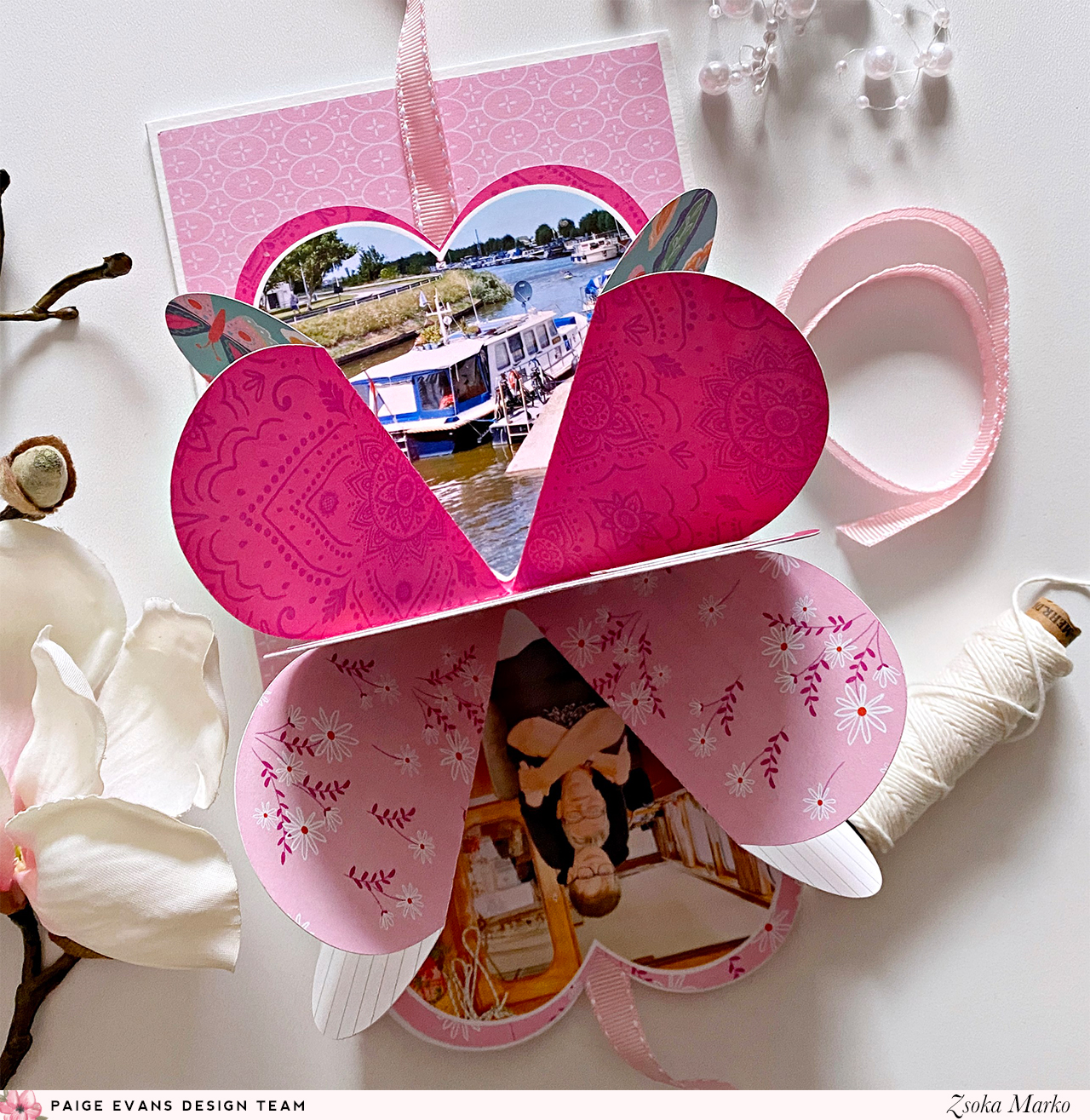
I called these "cards with a twist" because the hearts reveal some photos when you open them. Both cut files I used are for mini albums, but I thought they would be perfect for my purposes. 

In retrospect, I should have used the Folding Hearts on both, because that one ended up being less thick (better for mailing) and fits bigger photos too. I like both though, and for mini albums, where you don't need to worry about thickness, they would be both just as adorable!


I used the Go the Scenic Route collection and went with a pink/orange/red color scheme. I love this combo so much, it's cheerful and fun! Once I selected my papers, I sat down to my PC and sized the cut files to the right size - for this I drew a 5x7" rectangle, which is my card size, and placed the hearts on it, to see what size I want. Then I scaled down the cut file (all pieces grouped together). I then die cut everything I needed for both cards and printed my photos in the right size and shape too (for my first card I used heart shaped photos). 


Putting together the heart is self-explanatory, you just need to fold the paper along the lines, and you'll see it all come together. I did film the process though, you'll find the link to the video at the end of this post, if you're more the visual type!


Once I glued all the hearts together, I added my photos as well. I only added two card stock stickers to embellish the photos, because I didn't want to add more dimension to the card. I was somewhat sad because I love layering things up!

I then started working on the card bases. They are very simple, I started with a layer of white card stock, then a slightly smaller patterned paper panel. And because I love adding patterned paper strips at the bottom of everything, I did that here too. 

To close the heart, I added some ribbon - which I glued in between the folded hearts and the front cover. I also adhered a piece of heavy weight card stock to my heart cover, so it is sturdier and added some machine stitching for interest. Then I glued the mini onto my card front.


Finally, I decorated the front of the mini - for this I used a few flower die cuts from the ephemera pack. For my sentiment I selected letters in matching colors from the Puffy Word Stickers pack. I like to mix and match letters from this pack instead of using the words that are in there. I stitched these down on a piece of white card stock, which I then tucked under one of the flowers.


The mini album is a bit different on the second card - I needed 3 sections to have enough space for 4 photos, on the other one 2 was enough.


I die cut the base of the album from white card stock and used patterned paper for other pieces that you need to glue on the base to make your mini fun and colorful. This album is pretty straightforward too, as you fold and glue the pieces together, you'll notice which way to fold each section so it all collapses the right way. 


Again, I only added 2 card stock stickers to avoid adding more bulk to the card. It's quite boring this way, but I figured, these are cards in the first place, so the hidden photos are already a bonus haha!

Originally, I was planning to punch holes and use eyelets on the right side of the heart, to close it with a ribbon, but I realized that the heart would then open up on the left side. So, I ended up adding the ribbon the same way as on the first card, but this has a downside too - the album doesn't open up the way it was intended. You can still open it and see the photos, but the album won't unfold completely. I guess that's OK though, in this case. If it was a mini album, I would probably just wrap something around it, that is removable.


Because I love the paper I used for the cover so much and even made sure I die cut the heart from the part of the paper that had all these colorful little hearts on it, I obviously was not going to cover it all up with embellishments. That paper is just too special! So, I decided to only add a sentiment. To finish off this card, I placed a few glitter enamel hearts on the paper strip at the bottom. They are the perfect colors too!


That's it! I hope you like this idea and will give it a try sometime.

Oh I almost forgot to link in the Process video! Here it is:


I managed to finish the third card, that I mentioned earlier, too, but I don't want to re-write the whole blog post, so I'll just add some photos here. This is the same as the first card, only with different patterned papers. I love blue, so this one may actually be my favorite!


Thanks for stopping by today! Have a wonderful day!

X

Thursday, January 14, 2021

Summer - DT Layout for Paige Evans

Hi there crafty friends,

I'm stopping by to share with you my latest project I've created for the Paige Evans Design Team. I've used the awesome Go the Scenic Route collection on this layout. Apropos collection - are you as excited as me about getting Paige's latest collection, Wonders?! It's so gorgeous and perfect for spring! I need sunshine and colors! Today's page is proof of just how much I miss sunshine hehe!


I left a bit of white edge around the layout in this photo, so you can see the edges - the white is my desk, not a part of the layout :). The cropped version just didn't look right!

Anyway, I chose an orange and pink color scheme, to go with my pink lemonade in the photo. I've been wanting to use this map paper for a long time because it has such a lovely color (and I am not even a huge fan of orange!), but I just didn't get around to do it yet. In fact, I thought it looked too much on this layout too, but then I just went with it anyway. 

I chose the Summer cut file (Design ID: 272002) and die cut it in 3 sizes from white card stock. I left the smallest one as is, I just cropped the top off in Silhouette Studio. I did, however, remove all lines from inside the circle on the other two sizes, because I knew they would only serve as layers. To make my life easier, and not having to back the rays one by one, I just die cut the sun from three patterned papers. For this, I released the compound path on the cut file, then welded all lines together to create a fill shape rather than having outlines. Then I also did an internal offset a bit smaller than the original design (all three sizes), just so that they are easier to line up and there's no overhang in case I'm not precise. I hope that makes sense!


I adhered the patterned papers to the white outlines, but I didn't add glue to the rays as I wanted them to be more dimensional. I added machine stitching to the smallest sun and I also die cut the letters from a pink/orange patterned paper to place on top. I wrote my journaling inside the sun with a white gel pen.

To emphasise the sunny theme, I cut my background paper in strips that look like sun rays. Using my Tim Holtz serrated edge scissors, I distressed all edges. I then added a tiny amount of glue along the middle of each ray and placed them on a heavy weight card stock. Just so that they stayed in place while I stitched them down in the middle. Once done, I adhered the sun to the background too. 


I layered some tissue paper, die cuts, labels etc behind my photos, then glued these stacks down too. I added a clip, a chipboard sticker and some stickers to embellish my photos. I wanted to keep embellishing to a minimum since the page already had a lot going on, lots of dimension and texture. I stamped my date on one of the labels and done!


That's it guys! What do you think? Too much? These bright colors make me so happy!

If you want to see how this layout came together, you can watch my process video here:


I hope I could inspire you in some small way! Thank you so much for stopping by!

Have a wonderful day!

X


Thursday, August 27, 2020

Endless Summer - DT layout for Paige Evans

Hello crafty friends,

I'm stopping by today to share a new layout with you that I've created for the Paige Evans Design Team! 

As you know, Paige's new collection, Go the Scenic Route, was released recently, so I'll be using this wonderful new collection! It's perfect because we just got back from holiday, so I have a million new travel themed (and other) photos!


When I saw this orange/pink paper, I immediately thought of the sunsets at the beach that we often had to go see because they were just too beautiful. Unfortunately, my Selphy doesn't print vivid colors (like not even close to the real colors) but I think this photo still fits that background paper just fine. I generally stay away from scrapping photos like this because normally I don't find collections/papers that go well with them. I'm glad it worked out this time!


I cut the Endless Summer cut file (Design ID: 327560) from white card stock, then backed the waves with different blue tones of a single paper, plus I added a dark blue patterned paper at the bottom, behind the letters. I backed the sun with an orange patterned paper but didn't back the rays because I wanted the background to shine through.


I then fussy cut out all the letters from a variety of pink/red patterned papers, glued them on the white fall out pieces from the original cut file to make them hold up better and added them back into place using foam adhesive.

I chose a few embellies to decorate my page: chipboards and die cuts. Aaaaaaand something super cool! My friend Sandra posted a few buttons on Instagram that she made with the new We R Memory Keepers Button Press that I'm dying to have - and one of them was using Paige's paper from this collection. So, I asked her if I could have some of those buttons and in 2 days they were in my mailbox wooohooo. At that point I had several layouts ready, so I checked which one I could use the button for. I thought the middle of this large chipboard flower was the perfect spot for it :)


I wrote my journaling using a white gel pen, then I splattered some white acrylic paint all over my page (obviously covering my photo with a tissue paper). 


It's a very simple page but I think the stunning background paper adds so much to it! What do you guys think?

Thank you so much for stopping by today!

Have an awesome day!

X

SUPPLY LIST:

Friday, January 10, 2020

Happy Embrace - DT layout for Paige Evans

Hello there crafty friends,

Happy New Year! I hope you had a wonderful, relaxing holiday season with your loved ones!

I'm back with my first layout of 2020 :). For today's post, I went back to Paige's second, breathtaking collection, Take Me Away . If you are lucky enough to have it in your stash, go get it out now and start creating! I promise you'll love the process. While I love new collections, I notice that rediscovering old favorites fills me up with inspiration and so much joy.


While this collection is actually quite pastel as a whole, I managed to make a pretty bold layout with it haha! These colors make me smile during this dreadful, gray winter time!

I started out by die cutting the Folk Art Floral Background cut file (Design ID: 303006) from white card stock. I love folk art! Random fact: I used to do folk dance as a kid! I even danced with a decanter (filled with wine) on my head. I didn't drop it either, ha! Good old times!


I chose a few patterned papers to back my cut file. Once done, I decided on a background paper - I usually try several options, take a photo of them and then select something I like the most in that moment.


I actually wanted to scrap this photo in color but all that greenery in the background and my brown leather jacket just didn't go with my bold paper choices. I layered some tissue papers and a couple of die cut frames behind my photo, then glued it all down. Some of the embellishments are from other collections. My title for instance is from Paige's very first collection, Fancy Free! I had 2 of the chipboard sheets back then, most of which I already used up long ago. But I still had 2 of this red title, so it was time to use it. I was so happy that Embrace actually fits my photo perfectly!


Then I have a puffy sticker and a chipboard piece from Whimsical, a tag sticker from Pick Me Up, I believe. The suede bow, 3 of the buttons and the two small die cut frames behind my photo are from Take Me Away. The rest of the buttons are from my stash. Using a needle and twine, I stitched them on the layout.


I added my journaling with a white gel pen and splattered some white paint all over my background. Done!

I hope I could inspire you in one way or another! I'll be back with a new layout soon, which I also made with Take Me Away - but it will have a totally different vibe. I think, anyway!

Thank you for stopping by today!
Have an awesome day!

X

Friday, June 21, 2019

Out and About layout inspirations and a Song to Say Goodbye - DT projects for Pinkfresh Studio

Hi there crafty peeps,

I'm stopping by today to share two new layouts with you that I've created for Pinkfresh Studio with the awesome Out and About collection.

With these two layouts I'm also saying goodbye to the Pinkfresh Studio Scrapbook Design Team. It's been an honor...It was a very difficult decision for me and it's very hard to write this blog post too. 

I discovered Pinkfresh a few months after I started scrapbooking in 2015, thanks to Ashley Horton and her use of those awesome rainbow colored wooden chevron pieces which I still have a million packages of (yeah, thanks Ashley!!! Haha!). It was not easy to find PF supplies here back then, in fact  that's how I discovered Scrapbok Werkstatt (which became my favorite scrapbook store and later my second home as a DT member for a few years) on my quest of finding those chevron pieces. Ahhh memories! :( 
Pinkfresh has been one of my favorite companies since then. Together with Basic Grey and Fancy Pants, one of which doesn't do scrapbook collections anymore and the other...I'm not even sure what's happening to the other. If you know me, you know that I am a fan of small, family run businesses, unique, revolutionary designs that break rules, that don't care about trends. Patterns and color combinations I don't find elsewhere. To me Pinkfresh Studio is all that. Pioneers.

OK, I don't believe in coincidences. You know what just started playing on the radio...Nelly Furtado's All Good Things Come to and End. Seriously?! Tears running. But I do believe this was the right decision for me right now.

Thank you Kinnari for having me this past year! Thank you for having faith in me and for your continuous support!

Sorry guys for the long intro, but I had to say all those things!

Back to my layouts phew! Since most of our photos are travel photos I decided to work mainly with Out and About on both these layouts with a bit of other collections mixed in there (patterned papers). 


I first cut this gorgeous Paige Evans cut file from textured white card stock, then backed it with various patterned papers. Once done, I carefully glued the thin frame on the New Places paper, then stitched it down so that it surely stayed put. I then fussy cut out the whole middle part (I actually really loved the cut file on the rainbow paper but I thought it would end up too busy once I add photo and embellies).


I turned the frame around and added foam tape everywhere, on the back of some of the flowers and leaves too. Then I adhered it on the Scenic Route paper. I thought the street map design fit my photo well.


I layered some tissue paper and a bunch of die cut pieces, tags and labels behind my photo and glued the whole stack down in the middle, tucking a part of my picture behind the cut file.  I added a few embellies, die cuts, epoxy clip, puffy stickers, not too many because I wanted the papers to shine. I'm all about patterned papers, can't help it! I stamped my date and added my journaling, done and done.


On my second layout I used a cut file that will soon be available as a freebie in the Pinkfresh Studio Facebook fan group, so don't forget to check every now and then for new cut files! I backed the flower and leaves with patterned papers and also die cut some layered flowers for additional dimension. I need dimension and texture.


The white cut file was pretty much invisible on the background so I glued the stamp on a yellow card stock and fussy cut around it, leaving a bit of outline. Please excuse my fussy cutting, I don't normally do such a bad job. I also could have done this using my Cameo but it was an afterthought and by then I closed down the Silhouette software and I couldn't have gotten the sizing perfect.


Since I used this stamp cut file I thought it would be great to use the Tickets paper with all the different stamps on it. Or at least a small part of it. The top bit of my background is the Present and Perfect paper from the Everyday Musings collection, the bottom part is the Travel Icons paper from Out and About, turned on its side.


Using foam adhesive I glued down the cut file on my background. I added the 3d flowers and started embellishing. Enamel dots for flower centers, and a few die cuts, puffy stickers around my photo. I stamped my date on a label sticker.


Last but not least my title. I'm obsessed with the Adore Alpha die set (coordinating stamp set also available!), I think it's the best alpha die set out there! It's also two for one since you get outlines and inner pieces as well. So I die cut my title from white card stock once, then from the New Places paper as well. I was debating which version I should go with, rainbow outline with white letters or the other way around. In the end I liked this version better. I added pop dots behind the letters and glued them in place. To finish off my title I used the mini puffy alpha stickers from the Everyday Musings collection. That's about it I think!

So while I was trying to put this post together, several other songs came up (to be fair it took me half a day to write this haha), like Verve's Bittersweet Symphony and Placebo's Song to Say Goodbye. Really?! I mean REALLY? Ugh.

Have a wonderful day!

X

Friday, June 14, 2019

Take Me Away - DT layout for Paige Evans

Hello there crafty friends,

I'm back today with a new layout I've made for the Paige Evans Design Team!

A while back I was working on some cards for Spellbinders (you can check the blog post here) for some of which I used Paige's older collections and all of a sudden I felt the urge to use one of those for my new layout. I chose Take Me Away because it's what I used least in the past. At the time it came out I still refused to use flowers and feminine colors on my boy layouts so I didn't buy a whole lot of the collection. It's a shame really because it is gorgeous!

Now that I use whatever I want/like on my layouts, I totally could have gone with flowers, right?! Then what do I do? I pick a cut file that is not all that feminine nor does it have anything to do with flowers hahaha! The most photos we have are from our travels and now that I don't make a lot of layouts I wanted to make sure I scrap those photos first. So I guess give me all the travel themed collections, ha! 

Anywhooo...The cut file I chose is called Signage Post (Design ID: 293593), I thought it would be perfect for a travel layout. I totally love road signs, no idea why, is that weird?!


I backed the cut file with different patterned papers: I started with yellow tones at the top then pinks and purples going down. For the pole itself I chose a stunning deep blue floral paper.


I added some tissue paper, tags and die cut frames behind my photo and glued it all down around the middle of my page. I placed the cut file on foam adhesive and attached it to my background, slightly overlapping my photo. I selected some embellies which I added on top of the signs: chipboard and wood veneer arrows. I also glued a wood veneer geo tag on my photo! These pieces are so cute!


Lastly, I added my title, journaling and date. The title is from the Foam Phrase Thickers pack. I think now I only have 2 words left (and I had 2 packs) which is so sad because it's one of my favorite! The font is perfection, the words/phrases are versatile and there is a sheet of gold words as well as the most amazing pearl white I ever did see! I truly don't have anything else in that color and it literally fits everything. So sad :(.


That's it for today! I hope I could inspire you to dig into some of your older stash and create something lovely! I for one love working with older collections!

Thank you so much for stopping by today!

Have a wonderful day!

X


Friday, May 10, 2019

Viking hat or not? - DT layout for Paige Evans

Hello there crafty friends,

I'm back today with a new layout I've created for the Paige Evans Design Team. I've used the fabulous Horizon collection! I seriously can't get enough of these papers! 

I've been on a rainbow kick lately it seems...But when all the colors of the rainbow are there in a collection, I find it hard to not use them all haha!

I've had this photo of Maxim on my desk for months now and just couldn't use it on any layouts before. Normally I do the layout and then select a photo that matches from the pile I have on my desk. It is not a huge pile but normally it works. But this one just didn't make sense on anything, even though the colors were perfect for any rainbow layout. So I asked Paige to design a Viking Ship for me because I REALLY wanted to scrap this photo. So there you have it, the coolest Viking Ship cut file (Design ID: 293122)! I love it, it's so perfect!


I cut the cut file from textured white card stock, then backed it with loads of different patterned papers. It was important that I can use rainbow colors (Maxim's scarf has rainbow colors) and the flag was perfect for this! I also added rainbow colors behind the shields (according to my kid those are shields, so...shields then!). The waves needed to be blue of course as well as the background and I'm super happy with this background paper because it looks like sky and water! And the boat itself...I thought green will be fine and when I placed this paper behind the cut file, it looked like dragon scales to me. Happy accidents!


Once done, I was trying to figure out what I want to do with the page. I glued down the ship in the middle using foam tape to add dimension and also because I wanted to tuck embellishments behind it. 


I layered some tissue paper behind my photo and glued it down, sort of like he is sitting on the ship lol! I loaded his suitcases too :D. Too funny.  This collection is perfect for travel photos, which is what I have the most of so of course I love working with it! I especially love all the sticker/puffy sticker word strips because there's a few themes to choose from, they come in rainbow colors, so I can add them to pretty much all my layouts! One more thing I did, there was this triangular sticker that just screamed flag to me - I made a pole for it from a chipboard frame and tuck it behind the photo.


I added my journaling with a white gel pen and as I see I forgot to stamp my date haha! I wanted to add it on that chipboard ticket but would have had to sit down to my PC and search for the picture so I decided to do it the next day...Obviously it did not happen. Oh well :). 

Last but not least I splattered white paint all over my page.

That's it! I hope you like how it turned out and I could inspire you in a small way!

Thanks for stopping by today! Have a wonderful day!

X

SUPPLY LIST:
Horizon Collection: Paper 24, Paper 22, Paper 19, Paper 16, Paper 15, Paper 14, Paper 13, Paper 10, Paper 8, Paper 7Paper 6, Paper 5, Paper 4, Paper 3, Paper 2, Paper 1, Shaped Paper Clips, Stickers, Chipboard Stickers, Alpha Thickers, Epoxy Stickers


Tuesday, April 16, 2019

Celebrate Friends - DT layout for Paige Evans

Hi there friends,

I'm back today with a new layout I've created for the Paige Evans Design Team, using the amazing Horizon collection! This was actually the first color scheme I put together when I got this collection, because I just love blue! And green too! Probably you can tell if you look at my kid hahaha!


I used 3 cut files on this layout: Kite (Design ID: 276424), Kite (Design ID: 276144) and Celebrate (Design ID: 288396). I cut all of these from textured white card stock. I backed them with various blue and green patterned papers.


I added foam adhesive to the back of the big title and one of the kites. I arranged everything roughly on the background so I knew where to put one of the kites that was going to be under the photo. I then glued it down, as well as the photo and the title. Last but not least I adhered the second kite down as well.


I selected a few embellishments that fit my theme and colors, epoxy and chipboard stickers and I also took apart a couple of beautiful layered tags that had those pretty blue flowers and foliage on them. I know right?! I'm so bad! Ruining such pretty stuff!


To finish off my layout I added my journaling with a white gel pen and also splattered some white ink around the page.


That's it! I hope you like today's inspiration!

Thank you for stopping by, have an amazing day!

X

SUPPLY LIST: