Wednesday, August 8, 2018

Rainbow flower cards - DT project for WOW! embossing powder

Hey crafty friends,

This month's theme at WOW! embossing powder is "rainbows". My fave! I love rainbows, they make me happy.

I generally don't use a lot of different embossing powders at the same time because I don't like warping. Plus the more times I emboss the same paper, the more stray powder I have, no matter what I do. So I decided to challenge myself to use several powders on my card and I'm glad I did.

Here's what I used for today's cards:


  • WOW! Embossing Pad
  • WOW! Primary Ebony Regular embossing powder
  • WOW! Metalline Perfect Plum Regular embossing powder
  • WOW! Primary Parma Violet Regular embossing powder
  • WOW! Primary Blue Tang Regular embossing powder
  • WOW! Primary Apple Red Regular embossing powder
  • WOW! Primary Bird of Paradise Regular embossing powder


I chose the Simple Flowers set from Altenew for these cards. It was the very first set from Altenew that I bought and to this day never used! It was love at first sight but I wasn't much of a card maker when I bought it ha!

I started stamping the flowers, one at a time, and embossed them in the above mentioned colors. See the warping of the paper? This is why I normally avoid embossing in different colors. I know not everyone is bothered by warping but I am, and this is why I also don't often do mixed media scrapbook pages.


I then embossed my sentiment in black too. Since I don't have yellow and the right shade of green embossing powders, I added these details with color inks from Altenew.


What to do with the warping...Then I had a thought. Why not send the card panel through my Cuttlebug. And while I was at it, why not add some dry embossing? So I picked a polka dot embossing folder and embossed the panel.


This helped so much with the warping! I will say that the embossing got a bit destroyed but I like the distressed kind of look!


I created an A2 size top folding (but landscape orientation) card base and adhered an A2 size color cardstock piece on top of it (on the other card I used patterned paper). I splattered some black ink on the card for contrast and done!


Not my typical cards since I prefer more layers and dimension but I do like the simplicity of these.


That's it for today! I hope I could inspire you in some way!

Happy crafting!

X


Monday, August 6, 2018

Scrapbook inspiration - DT project for Pinkfresh Studio

Hi there lovelies,

I'm stopping by to share some new layouts with you that I've created for the Pinkfresh Studio design team!

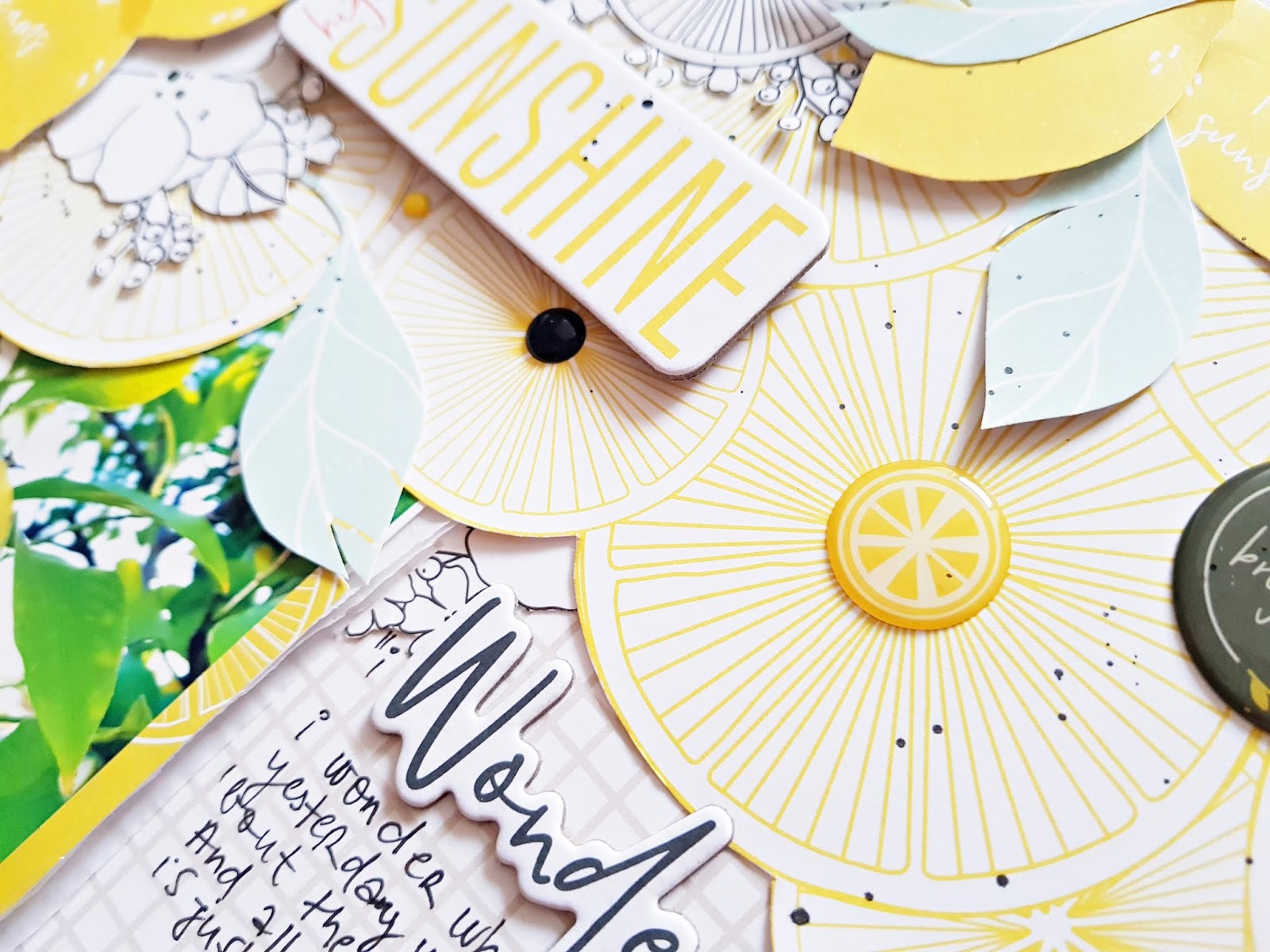
I love the fresh summery lemon theme in the Simple and Sweet collection and as luck would have it I actually have a bunch of photos of a lemon tree. While on holiday, we had our own lemon tree in the garden, it was so lovely!

I chose the Lemon Lush, the Sweet Life and the Good Things patterned papers for my first layout. I often go for this design where I have a bunch of things in two opposite corners, so I cut apart the Good Things paper and started building two clusters.


I added a stitched frame to my photo and tucked it under the lemons at the top. I fussy cut out some lemons and leaves from one side of the Lemon Lush paper and some black and white flowers and lemon slices from the other side of it. I like black and white for accent on such pastel layouts.


Varying liquid and foam adhesive, I added my fussy cut elements at the top and bottom. I also placed some chipboard and epoxy stickers as well as some enamel dots on my clusters.


Do you remember that song, Lemon tree from Fool's Garden?! It was a huge hit when I was at high school and it still often comes to my mind. And then what happens?! I find a "Wonder" chipboard in this collection, haha! So it had to be! Wonder became my title and I wrote a part of the lyrics around it, as well as my journaling. Added some black ink splatters and stamped my date, done!


My second layout looked better in my head to be honest but it's what it is. I'm sure we don't like every single layout we make the same way right?

I chose a cut file by Paige Evans and cut it from white textured card stock. I then backed it with scraps I had left of the Simplicity, Happy Life and Good Company patterned papers and two different pink card stocks too. One of the pink card stocks I used to back the middle of the wreath too.


For my background I chose the Happy Life patterned paper and adhered my floral wreath in the middle using foam tape. I cut one of the stitched frames to the size of my photo and lay it over it. I tucked this behind some of the flowers. 


For my title I went with Full of Joy from the gold foiled puffy stickers. 


I started adding embellishments, although not too many. I felt like this page didn't need more. I chose some chipboard and epoxy stickers. I used one of the tabs in the ephemera pack for my date, I just covered up the words in the middle with a piece of white paper.


I wrote my journaling all around the page because I didn't like it anywhere else. I was going to write it in a circle around the cut file but then my friend Enza suggested this and I liked the idea. 


I splattered some gold paint all over the page and done!

I also have a third page for you today, this one was created for the Pinkfresh Studio August challenge:


Here's my take on the summer theme and the pastel colors! I think this is my favorite of the three layouts even though I wasn't even sure I want to make it. I love big titles but I'm also kind of tired of them.


I used the Simplicity patterned paper for background because I haven't used this one before. I cut the title from pink card stock and backed it with the other side of the Simplicity paper. So that the title doesn't get lost on that busy floral background, I layered some white card stock behind it as well. I glued the white card stock on the background, then I added foam tape to the title and glued it down too. This way there's a bit of depth to it and it stands out even more. I layered some scraps and ephemera pieces behind the photo and tucked it all in behind the letters.


I went through all the embellishments I had and selected the ones that fit my page. I arranged them the way I liked them and adhered them all down. I ended up using puffy stickers, chipboard stickers, ephemera, epoxy stickers and enamel dots as well.


I stamped the date, added my journaling and some black paint splatters to finish off my page.


That's it for today guys! I hope you like the pages and are inspired in one way or another!

Thanks so much for stopping by today!

Have a fabulous start to your week!

X


Saturday, August 4, 2018

Card inspiration - DT project for Paige Evans + Silhouette

Hey there crafty friends,

I'm stopping by to share a card duo I've created for the Paige Evans + Silhouette Design Team!

I had a vague memory of having a 6x6 paper pad from the Take Me Away collection, but really wasn't sure if I just dreamt it...This is the collection I have the least supplies left of, especially paper, so I was literally jumping around with joy when I in fact did find it!

So for today's cards I'm using this collection!


First up is this card, for which I've picked out the Organic Flowers Background cut file (Design ID: #249892). 


First I scaled down the cut file a bit so the design was smaller, then cropped it to an A2 size (4.25x5.50") and cut it from a mint patterned paper. I backed it with a darker shade of mint paper and glued this panel onto an A2 size top folding card base. I then went through my embellies and tried about a hundred different options before I settled on this design. 


I added a floral chipboard frame in the middle, then layered some chipboard flowers in one corner and die cut flowers in the opposite corner. Before adding the die cut flowers from the ephemera pack, I glued down some tangled gold thread onto the frame too for additional texture. Last but not least I added a yellow suede bow and a chipboard sentiment. Oh, I almost forgot, I also splattered some gold paint on the card front!


For my second card I've chosen the Geometric Background Stitching Pattern cut file (Design ID: #271163). I chose this yellow striped paper that I used on a layout too once, in 12x12, and I actually stitched the title on that too in yellow! So I thought I'd add stitching to this as well, and to make my life easier, I went ahead and tried this stitching template cut file. It surely saved me some time not having to poke all the holes myself! I scaled down this design too and then cropped it in a way that it was symmetrical in A2 size. I then sent it through my Cameo.


While I was watching The Originals on Netflix, I hand stitched the panel. Once ready, I attached it to an A2 size top folding card base, using foam adhesive. Mostly because when you stitch, you have a bulk of thread on the backside and the card front wouldn't be smooth if you just glued it on with normal glue. Hence, foam tape. 


I made it my purpose to finally use this heart wood veneer ha! I made 3 cards before this one which I was planning to use this heart for but I never liked the way it looked. Now I finally do! I didn't want to cover up much of the stitched design since I spent so much time on it, so I kept embellishing to a minimum. I glued some tangled thread under the wood veneer, then added some flowers on top that I fussy cut from a gorgeous patterned paper. 


To finish off this card, I added a chipboard sentiment using foam tape and splattered gold ink here and there. Done!

I hope you like today's inspiration! 

Thanks for stopping by and have a lovely day!

X

SUPPLIES:  Take Me Away collection - 6x6 Paper Pad, Wood Veneer Shapes, Suede Bows, Chipboard Stickers, Ephemera Die Cuts